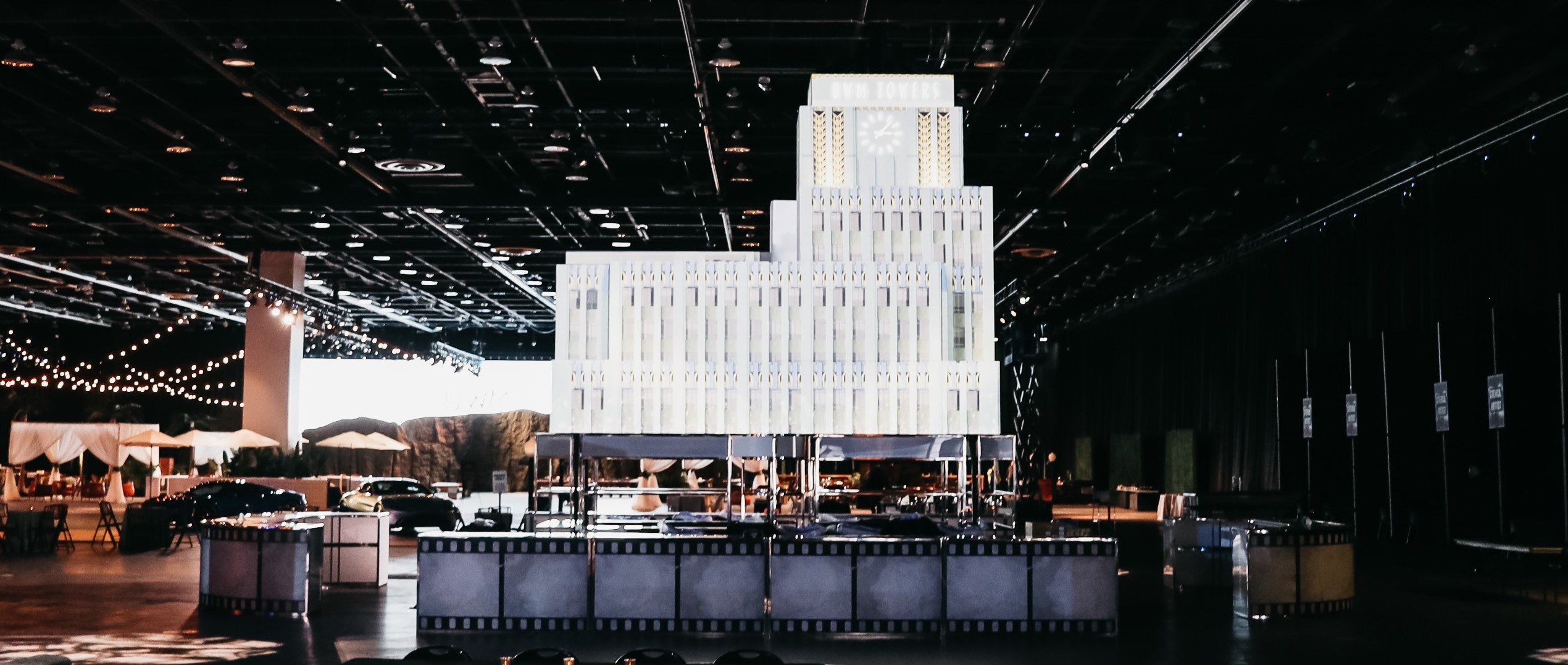
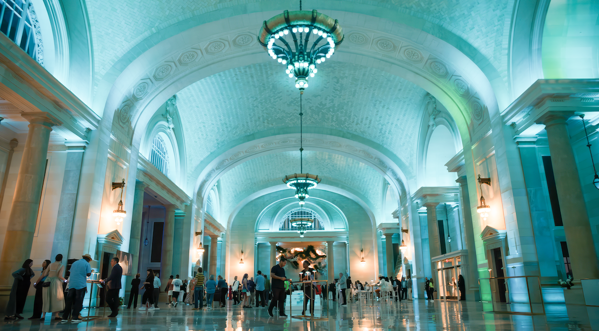
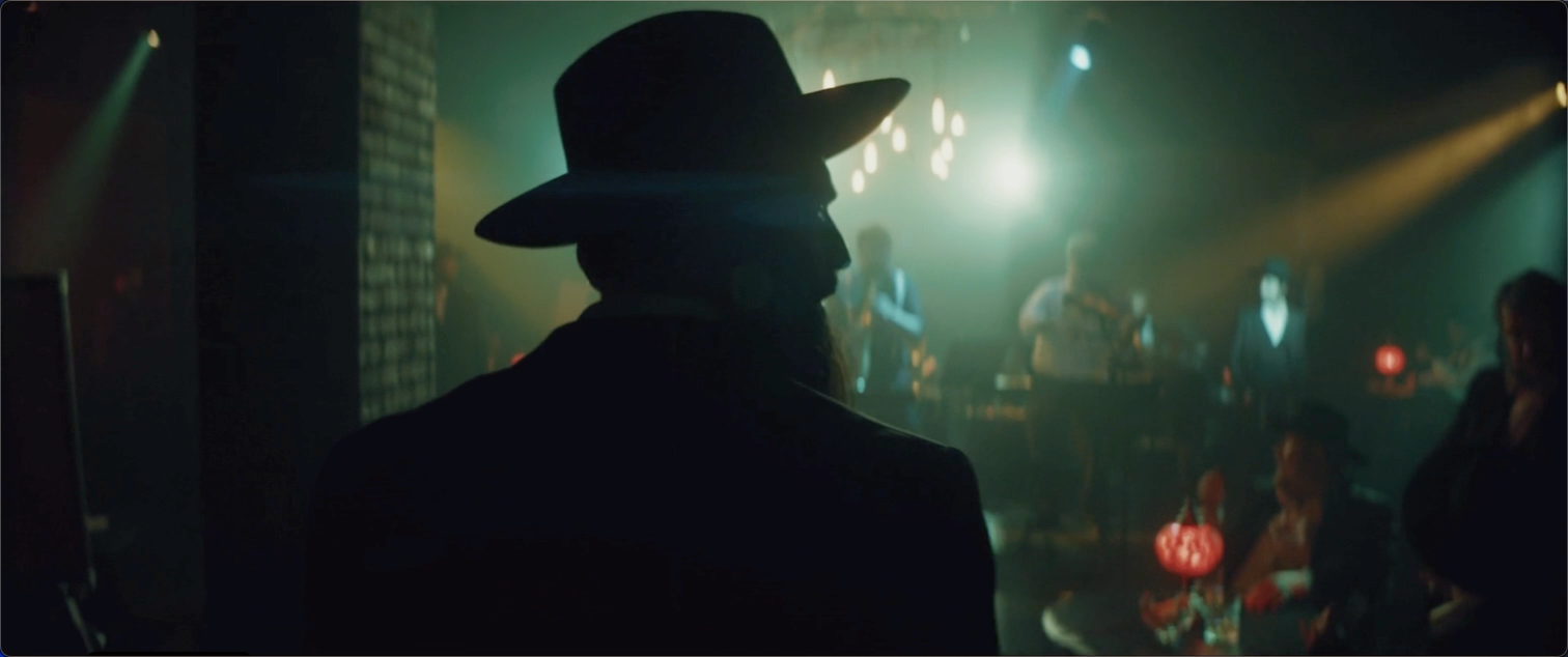
The art of mixing and matching is trending upward in event planning of all types. It started in weddings, mostly, but today even major corporate events are catching onto the trend. It can transform an ordinary seminar, team-building event, or launch party into something extraordinary without — and this is the key — dramatically impacting the budget.
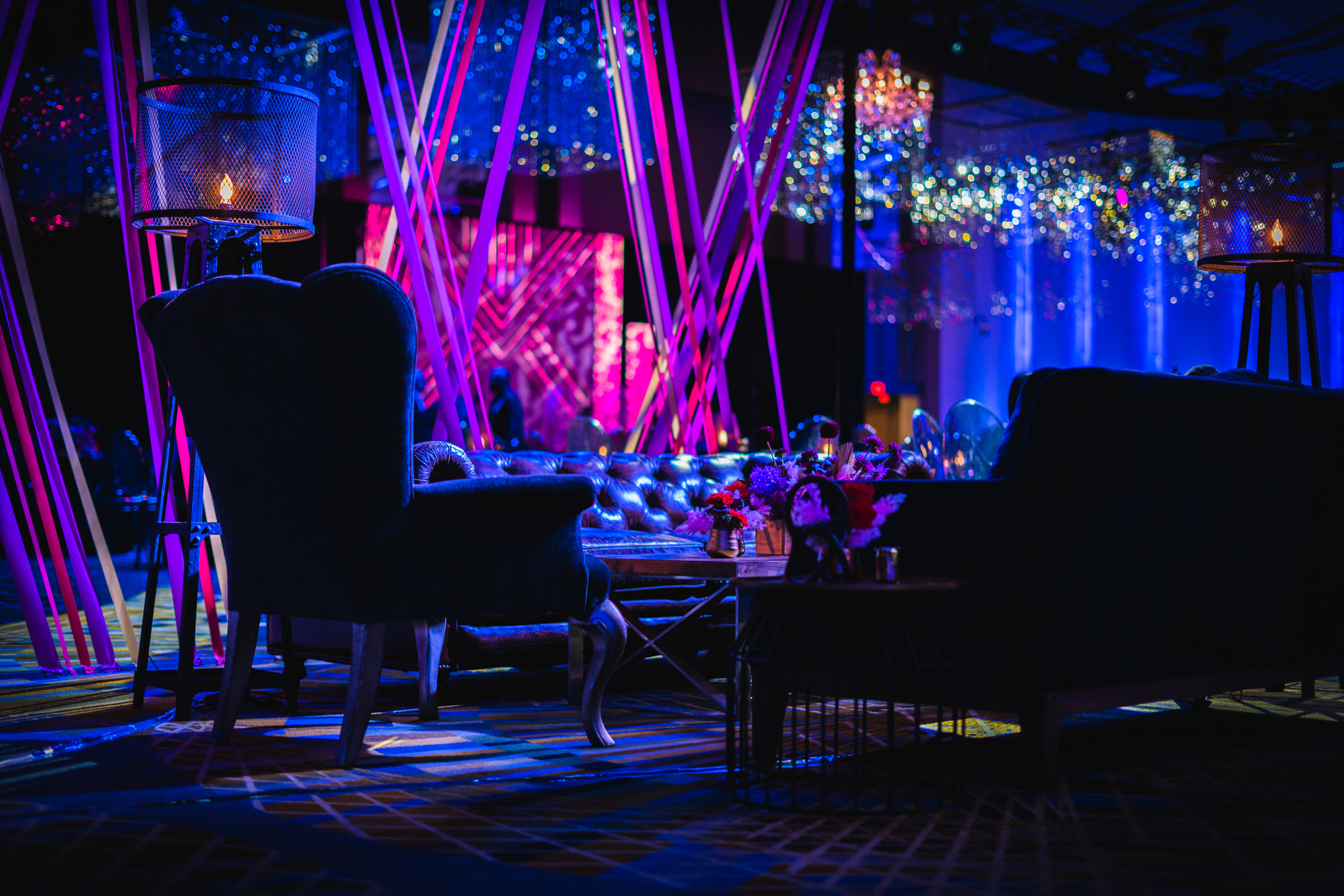
The added visual layers and eclectic twist given by blending opposing elements gives any event a fun, relaxed, and quirky atmosphere. You can mix up:
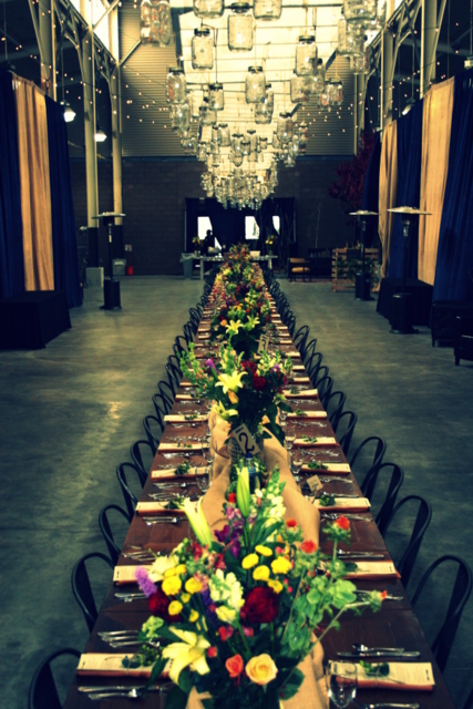
• Elements: Natural vs. Modern, for example, would have bamboo placemats on top of all-glass tables, or rustic rough-hewn beams and walls with plasma-screen TVs on swivel mounts. You can also take it the other direction and have an outdoor event with stainless steel trellises
• Colors: Muted vs. Pastel would give you a lot of visual ‘pop’, especially as napkins or chair cushions. Often something as simple as having some of the color scheme be based on the company’s logo or icon and the other part simple white or black can give you quite a bit of visual interest while keeping the company theme strong.
• Shapes: Angular vs. Rounded china, chair backs, or even spotlight frames keeps the eye roving. A circular booth for the bartender and a rectangular one for the food service; a square stage for the speakers with a scattering of ovals in a modern-art installation behind him — the possibilities are endless.
• Patterns/Textures: Chevrons on the napkins, but plaid on the tablecloth? Absolutely! Rainbow polka-dots and flowers mix well, but when you add a black-and-white herringbone pattern to contrast them against, they stand out all the more dramatically.
Wait…did we seriously just suggest mixing rainbow polka-dots with black-and-white herringbone? OK, maybe we went a little overboard — but that was deliberate, to illustrate a point: part of the art of mixing and matching is keeping at least one coherent thread that unites your diverse array of visual elements. It’s a critical part of proper event design, and it can be one of the most challenging but most rewarding parts of event design.
It’s usually best if the uniting element is chosen first (and designed around). It also helps if the element has something to do with the event in question. For example, let’s say that your event is going to be an award ceremony. As such, you want your uniting element to be a gold medal, a la the Olympics.
Not everything has to directly relate to the gold medal, but you have a lot of options for how to unite things to the idea of a gold medal. You have the color gold; the colors red, white, and blue; the idea of a circular object with a loop on top; the idea of a ribbon; a metallic texture; a silky texture — the list goes on and on. By drawing on the qualities of the uniting thread without feeling the need to play directly off of it, you can extrapolate in ways that will make your event stunning and successful without being visually redundant or boring.