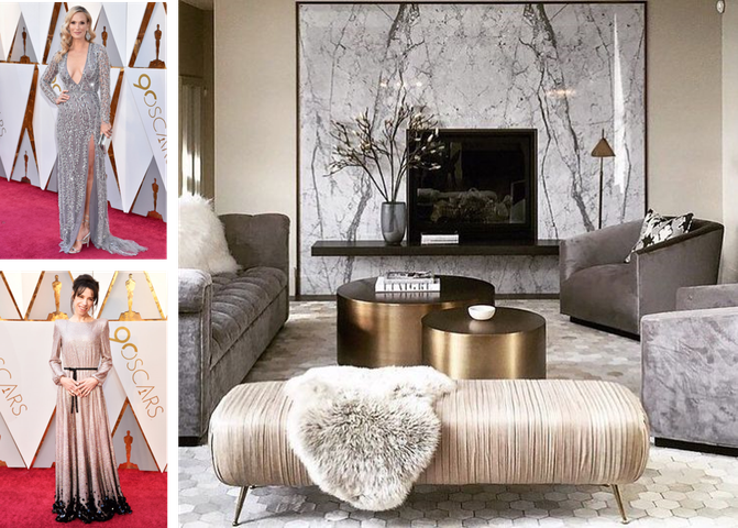
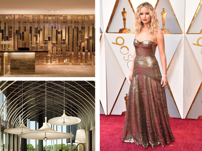
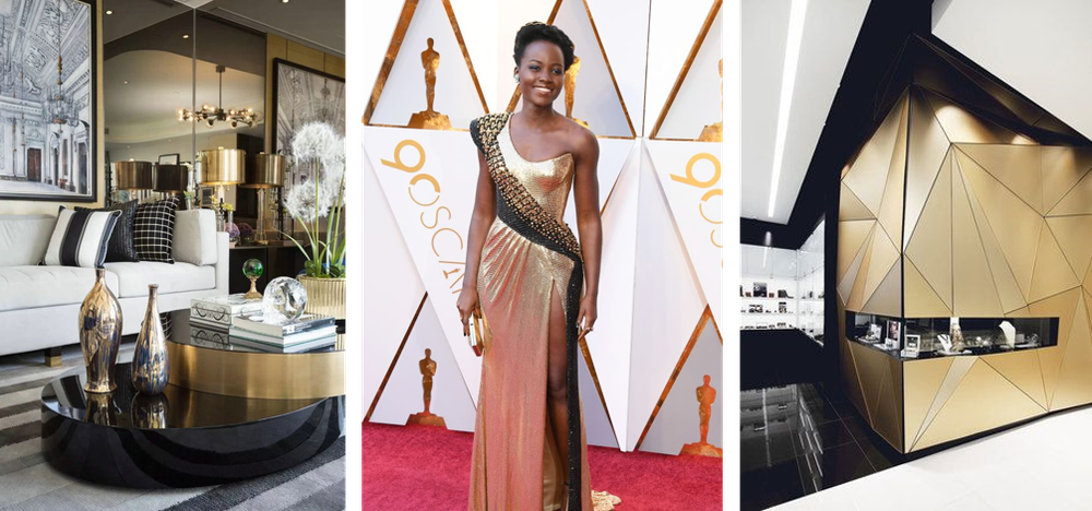
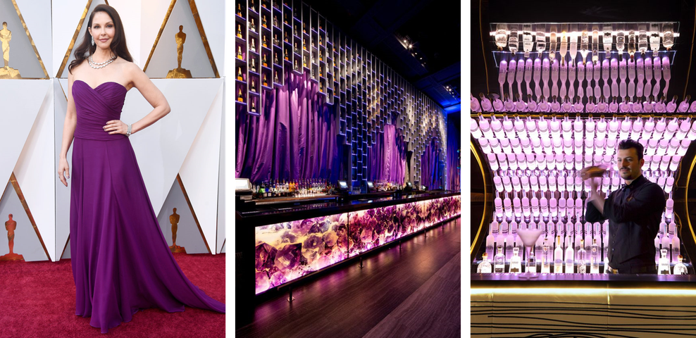
This past month were the 90th annual Academy Awards, and while the stage set was stunning, a lot of people tune in for the fashion. People often forget the parallels between art forms; a poem or song that inspires a painting, or a story that weaves itself into a fashion designers new line. Drawing inspiration from different mediums is essential to the creative process so we’ve broken down three color stories from this year’s Oscars and translated them into various spaces and design elements. Embellished dresses adorned in silvers and golds made an appearance on the red carpet. It’s iridescence and variations of structure play into a lot of trending design pieces. The use of silks next to velvets create that sense of warmth while the use of mixed metals add interest and that added layer of texture creating a cohesive ‘glam’ look and feel
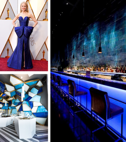
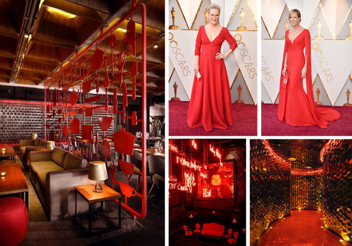
Bold Beauties
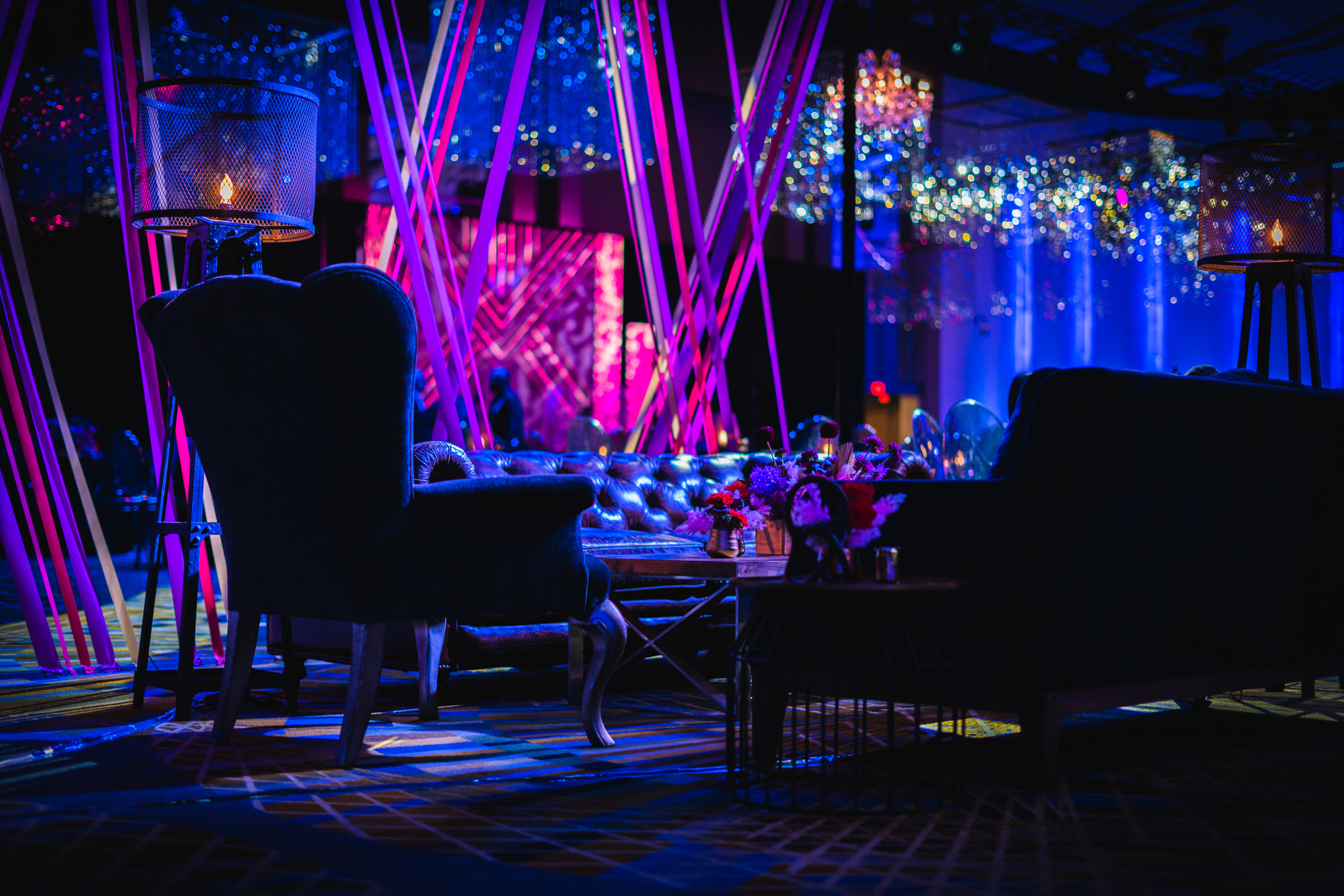
Bold colors make their way onto the red carpet every year, and it never goes out of style. Striking and vibrant they call attention and make for a powerful statement. Using saturated tone on tone colors breathe life into spaces, while layering the different hues within that color story add depth. In a lot of spaces, this is extremely effective in lighting in tandem with the right material and architecture.
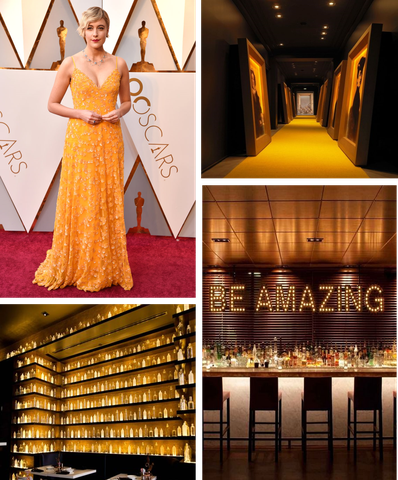
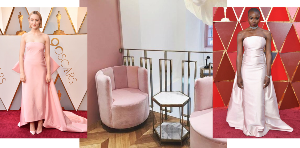
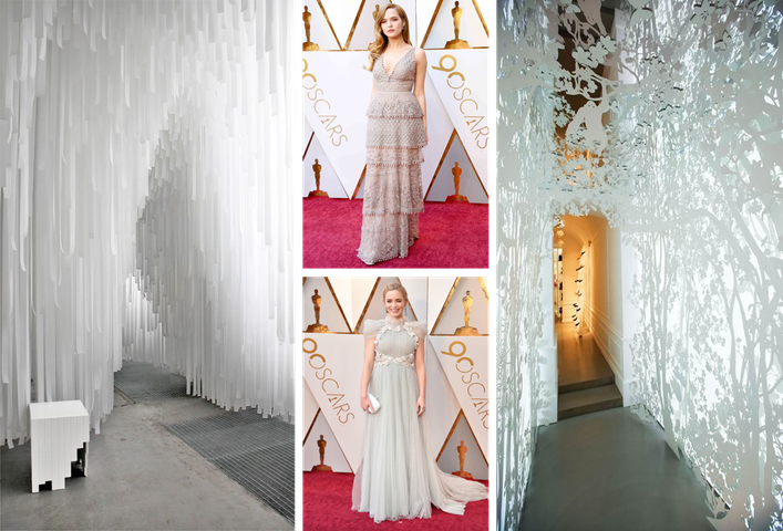
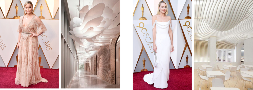
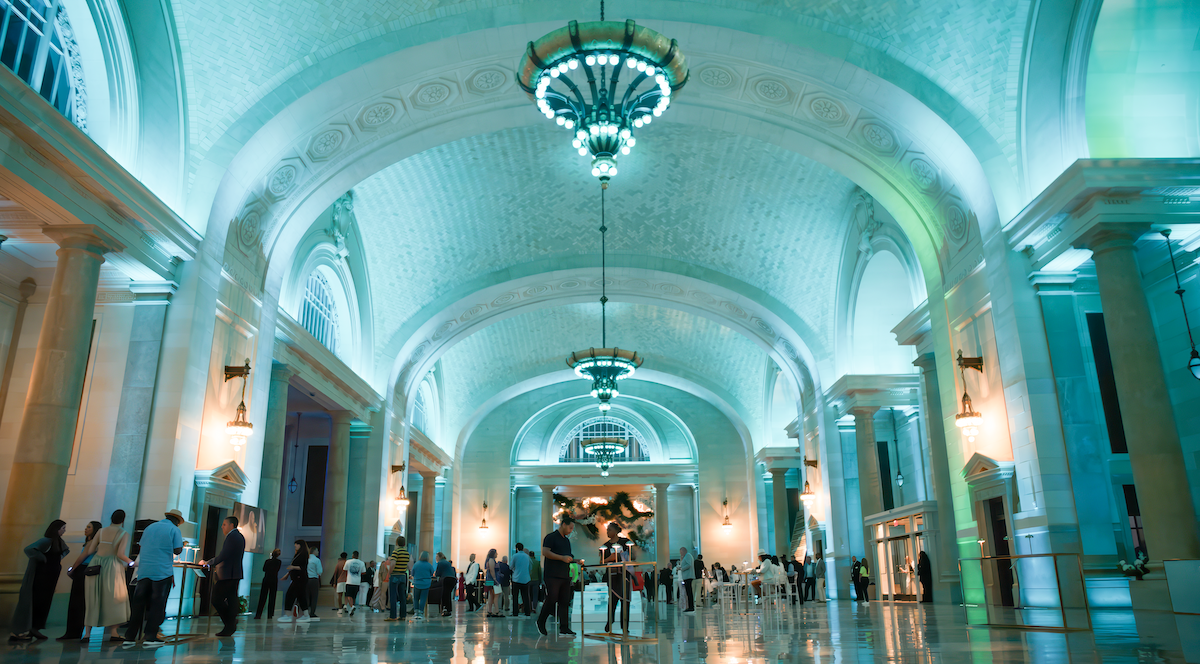
Soft + Sweeping
While there is currently a trend in ‘millennial pink’ this softer palette feels ethereal and airy which can easily translate into textiles and architectural elements. The minimalism in these tones lend itself to being easily manipulated through embellishments and structure. They’re soft and inviting yet hold onto that child like whimsy that is often associated with pastels. There’s beauty in it’s subtleness and can be elevated through the use of material and light.