Many of our customers, particularly the many fine caterers of Detroit, have the pleasure and important responsibility task enhance the full sensory potential of every dish to create a presentation that is practical, functional, and appealing to all the senses. Planning a design that enhances food presentation is an important way to reach the highest potential from the special skills that go into planning and producing a unified, thematic, and successful buffet or food station.
One of the primary purposes of food presentation is to be functional and practical enhanced food presentations integrate all aspects of the buffet, including the theme, the menu, the style of service, and our clients’ expectations. Our goal is never to simply to help them meet those expectations and standards, but to exceed them. A well thought-out and executed plan is a distinct advantage in any successful event. It is important to remember and always think of these techniques as enhancements to the food’s appeal; the real importance and focus of the food should always lie, ultimately, in its flavor and texture.
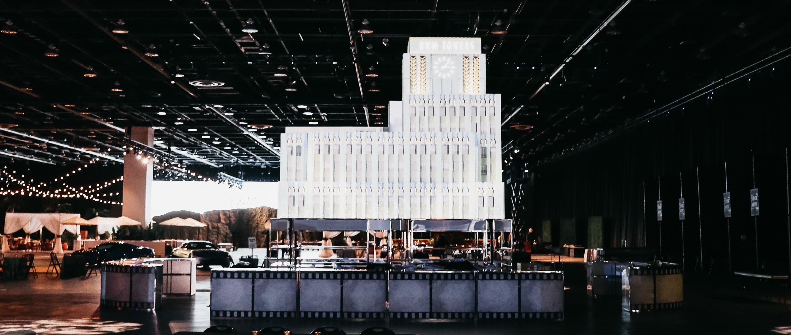
Continually advancing and growing our presentation platforms and methods for our customers is a focus of Display Group. The Detroit caterers are experts at taking the platforms we provide, and arranging the food items in the most appealing and practical manner.
A certain amount of regularity and repetition is comfortable and appealing, but too much of anything becomes monotonous, whether it is an ingredient, a color, a shape, a flavor, or a texture. Introducing contrasting elements adds energy and motion to an arrangement. However, when every element seems to stand on its own, the effect can be chaotic.
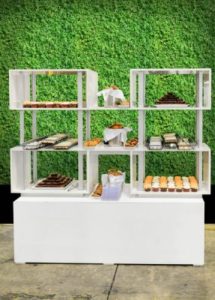
A food’s natural color is one important tool in platter and display presentation The color of a food can be used as an element in design. Our neutral white display element seen here allows the foods natural color to be the focus. We associate with colors in very specific ways. Greens give the impression of freshness and vitality. Browns, golds, and maroons are warming, comforting, and rich. Orange and red are intense, powerful colors. Colors that harmonize are those that touch each other on the color wheel (for example, green, blue, and violet are complementary colors, while blue and orange are contrasting).
We are proud to work with many of the premier food providers in Detroit, and help them create the perfect culinary event experience.